[06:20] Sxxxx Hxxxxx: [Posted 6:16pm PDT, 11 June 2012] We will be performing rolling restarts for regions on the main Second Life server channel. They will begin on Tuesday, June 12th at approximately 5:00AM PDT. Please refrain from rezzing no copy objects, making inworld L$ transactions and remember to save all builds.
[06:20] Cxxxxx Wxxxxx: [Posted 6:16pm PDT, 11 June 2012] We will be deploying more broken code and bugs to the grid. Please refrain from doing anything, ever again.
Pretty much.
Another day, another Mesh Around entry...
First up, Jinx'd has a taupe mesh drawstring top that's nicely done:
 |
| (from the scavenging album) |
Texturing is good, color's a nice sturdy neutral; there's some side seaming but well within acceptable visual parameters.
 |
| (from the scavenging album) |
Then...this. Alpha gapping again. Damn it all.
 |
| (from the scavenging album) |
From AMERICAN BAZAAR, OMG IN ALL CAPS, sheesh, people. Calm it down...comes the rainbow-toned "Ivy" dress. I honestly can't decide, for the life of me, whether I like this or hate it. I really don't know.
 |
| (from the scavenging album) |
The texturing is great, the blended colors are a lot of fun, and weirdly, I think I like the scrunching along the back. It's just...I don't know. Taken as a whole, there's something subtly off-putting. I don't know what yet.
 |
| (from the scavenging album) |
Maybe it's the silhouette? Couldn't tell you.
 |
| from the scavenging album) |
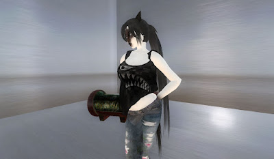
On the other hand, the "Gobbler" tank from Apple May Designs causes no conflict at all: I don't like it. The texturing is weird, the cut is odd, and that front design should never have been paired with an angled mesh template, IMO.
 |
| from the scavenging album) |
This is the back, and...yeah. Just not thrilling me, here.
 |
| from the scavenging album) |
This is the "Heart Splatter" tank, and...it's kind of the same problem, because it's the same template. The graphic is better, and nicely pops across the front of the garment, but...there's just an overall "meh" impression. Maybe I'm overtired.
 |
| from the scavenging album) |
And a detail of the side texturing. It just doesn't hang right, it's got that weird angle, and...eh. Maybe it's just not my thing, so I don't get it.
And, gods willing, some time soon I will tie this up, but for now...more to come!
No comments:
Post a Comment